
Tuesday, 17 November 2015
Stress Flyer
I first coloured the background to represent a serene colour in this case light blue, then i added the text showing the location and the time of the seminar. I then added a picture of a hand holding a stress ball to show stress.

Tuesday, 3 November 2015
Task 2 Light and Dark Collage
A digital collage which is supposed to represent the differences between light and dark. For my piece I decided to create this image below.
This collage was created by:

This collage was created by:
- creating a custom brush of the Mosta dome.
- created a rotated image of the dome.
- tilted the brush type to a diagonal
- added a background behind the angle, then changed its mode to Luminosity to become more eerie
- then I selected a crow, removed the crow itself and added it to a mask so that it would be transparent and take the background beneath it. I also set its mode to Exclusion
- I added the bottom left angle statue and gave it a difference mode so that the colours of the brushes would be inverted and create an even creepier vibe to the collage itself. (giving it a darker contrast)
- on the other hand,I gave the top right angle statue a linear light mode which makes it "brighter" compared to the other angle, thus creating a contrast between light and dark
- I added a sword to the top right angel to show the battle between the two, the battle of light against darkness. I gave the sword a linear burn mode so that it would be more visible.
- Then finally I added the text each of which individually: Light and darkness have the same effects which are a gradient overlay along with a drop shadow. Furthermore for "and" symbol i used cyan gradient overlay with Bevel&Emboss along with a drop shadow, so that it would be more visible in the collage itself.
- The font used is the Old English text Mt which I believed was the most suitable and ties the collage together.
Thursday, 22 October 2015
Saturation
Saturation can be defined as being the intensity and the chroma of a colour, which refers to the dominance of a hue in a colour where on the outer edge of the colour wheel the hue can be considered to be more pure. White, black and grey are used to reduce the colour's intensity and saturation.


As one goes to the centre of the colour wheel the hue of the selected colour is less dominant meaning that the colours directly on the central axis are considered to be desaturated.
Now the image below shows the opposite of the image above, the fact that the outer colours of the colour wheel have more saturation.
Colour Values and Hues
Hues are basically the different colours which have a different wavelengths. Few examples of hues can be Blue, orange, green and red.

The value of the colours indicates how bright a colour is. meaning that the higher the value the brighter the colour is or the more light it displays. For example if one were to take a bright yellow it would have a higher value, whereas the darker the colour the lower its colour value is.
Tints, Tones and Shades
Tints, tones and shades are basically different 'shades' of a pure colour. A tint is achieved by adding white to the selected pure colour, shade is when black is added to the colour and tone is when grey is added to the colour.
this meaning that a tint is lighter than the original colour, shade is darker than the original colour and a tone is softer than the original colour.


this meaning that a tint is lighter than the original colour, shade is darker than the original colour and a tone is softer than the original colour.
Print Vs Screen
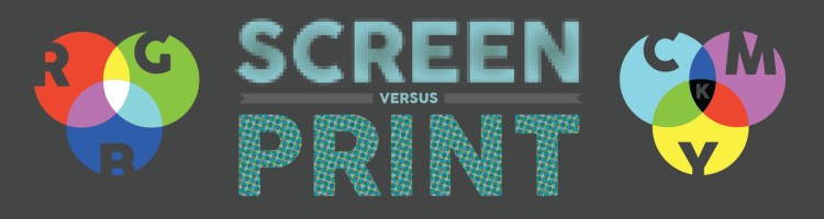 When a user decides whether they are designing something which is going to remain on screen or is going to be printed, they have to take into consideration every possible factor which can range from the types of media, the audience targeted, the colours that are to be used, the layout desired and the technology that is going to be used.
There are various types of media:
- magazines
- product packaging
- business cards
- logos
- HTML websites
- animations\
The types of media that i mentioned above are all different media in which the designer can transmit his or her audience the desired message.
It is important that the designer keeps in mind the targeted audience that is going to see this design, if elderly people are targeted it would be a grave mistake not to create the design to be printed.
The content has to be interesting enough to entice the viewer to stay on the page or to look at the design.
In print everything has to be taken into consideration as the design can be used for various uses. Make sure that the design is not clustered and gets the desired space. Also, the designer must make sure to have bleed when creating the design to ensure a good outcome.
On the other hand for screen, the designer hast to make sure that the 'app' or advert would look good on various screen sizes, as now a days there are a lot of variations from one screen to another.
The colour is also affected as print uses CMYK and screen uses RGB. Screen can also deceive the user on the desired outcome therefore it is always important to request a print preview so that the designer would know more or less how the outcome is going to be.
Obviously it always depends on what the company is trying to pursue for their product and for their adverts.
Wednesday, 21 October 2015
International Color Consortium better known as ICC Profiles
ICC profiles are used to describe colour whether if its light, dark, its range and even the distribution level of the colour itself. The International Color Consortium or better yet the ICC is used to analyse distinct colours in digital media. Basically the ICC creates the correct colours of inputted images either from cameras or scanners in order to present the image on a monitor or for print.
There are two fundamental types which are the input and the destination output, which originally consist of data which can be related to the devices co-ordinates that is the standardized colour space defined by the ICC.

Subscribe to:
Posts (Atom)