We had to select a word and apply an effect to explain the word chosen. For my word i decided to pick 'Injam' which translates to Wood in English.
The process of it is pretty simple, I created a text layer with the selected word, then i added an image of a wooden texture. I created a layer mask so that the wooden texture would be transferred on the word. the i added layer filters so that it would look a bit jagged like wood.
I created 2 which are the following ones:
Tuesday, 8 December 2015


Monday, 7 December 2015
Task 2 - Sunny Coast
This task was to provide an advert for the Hotel Sunny Coast, which was providing a weekend break special for its consumers,
in order to get to the final result I had various ideas which all had great features, but they all lacked some thing important - the lack of cluster.
This advert was inspired by the rising sun. I took an image of a rising sun and took it to photoshop where i created its paths to export them to illustrator, Once on illustrator i started to write down the required items which were:


in order to get to the final result I had various ideas which all had great features, but they all lacked some thing important - the lack of cluster.
This advert was inspired by the rising sun. I took an image of a rising sun and took it to photoshop where i created its paths to export them to illustrator, Once on illustrator i started to write down the required items which were:
- The hotel's name - Sunny Coast Resort
- Weekend break Special
- The contact info (email and telephone number)
- along with 4 stars to show the value of the hotel
We cad to do the poster in a specific colour scheme which was Black, White, and Red. Whereas the other one we where free to chose any colour that we wanted.
Below i have my final posters for the Sunny Cast resort:


Task 2 - Bacon Booklet
This aim of this task was for us to use grid lines in illustrator, along with implementing text in a text box so that it would be seamless in the text.
I started out by identifying the grid lines, where the writing space is in this specific booklet,
then i created a maroon coloured background to symbolize the colour of bacon.
Then i added a lighter box so that the text would be more viable on the booklet, then i added the text box and i split it up into 2 columns and 3 rows, so that the text would be spread out evenly.
I continued by adding the pictures and text wrapping them so that the pictures could integrate with the text.

I started out by identifying the grid lines, where the writing space is in this specific booklet,
then i created a maroon coloured background to symbolize the colour of bacon.
Then i added a lighter box so that the text would be more viable on the booklet, then i added the text box and i split it up into 2 columns and 3 rows, so that the text would be spread out evenly.
I continued by adding the pictures and text wrapping them so that the pictures could integrate with the text.

Task 2 - Grid Project
The aim of this task was to come up with various alignments on illustrator using the font Helvetica,
I came up with the following alignments, creating an interesting layout for various uses

I came up with the following alignments, creating an interesting layout for various uses

Task 2 - Face Paths Exercises
We selected an image from the internet and our task was to create paths and export the image on Illustrator,
The original image was the following:


The original image was the following:

When i finished creating the work paths I ended up with this finished result:

Task 2 - Exquisite Creature
we were split up into groups and the aim was to select a section of a paper, each section had to represent a 'thing' which is supposed to have a head, torso and 'legs' our group came up with the following monstrosity;
The Original Image
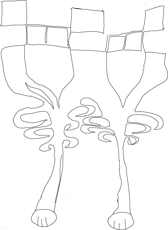
 Our task was to trace out the image to illustrator
i started by opening up the image on Photoshop, then I created work paths so that I could export it to illustrator, creating this final product:
Traced out image:
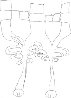
The Original Image

i started by opening up the image on Photoshop, then I created work paths so that I could export it to illustrator, creating this final product:
Traced out image:
Task 2 - Name Logo
I started out by sketching some ideas for a name logo, the final idea war rather simple and minimalist
the first idea consisted of a symmetrical alignment with my name which included a hexagon for the background and for the letter 'O'
 Then I came up with another logo which consisted of the following:
I started out on illustrator by typing out my name one on top of the other, then I tweaked the letter 'R' a bit so that it would show continuation with the other letters, finally I added the fleu-de-lys in the letter 'o' to show that scouting is my passion

the first idea consisted of a symmetrical alignment with my name which included a hexagon for the background and for the letter 'O'

I started out on illustrator by typing out my name one on top of the other, then I tweaked the letter 'R' a bit so that it would show continuation with the other letters, finally I added the fleu-de-lys in the letter 'o' to show that scouting is my passion

Subscribe to:
Posts (Atom)