Tuesday, 8 December 2015

Task 2 - Old Photo Restoration

We were assigned to restore the colour and fix an old picture, i decided to do one of my deceased grandmother.

It was an excruciatingly long processes as most of the colours had to be guessed since the original image was in black and white.

I did it by creating solid colour layers with the selected parts as masks, then i made them into an overlay or colour (depending on which looked best)

The final result was the following:


Task 2 - Dust Cover

I decided to pick The Handmaid's Tale as a book to do its dust cover.

The cover itself is made in a very minimlistic way as the most striking feature of  the cover are the handmaids at the bottom, which i managed to incorporate to the image, I edited the image so that 3 of the faces are green: these are supposed to represent 3 of the handmaids in the book.

Task 2 - Photo Manipulation

We were assigned to manipulate a photo of our fellow class mates.

I decided to add antlers and recolour his hair, along with a mike tyson face tattoo.
i used the liquefy tool to distort some features and also the clone stamp tool to give him another eye.

Task 2 - Textured Logo Type

We had to select a word and apply an effect to explain the word chosen. For my word i decided to pick 'Injam' which translates to Wood in English.

The process of it is pretty simple, I created a text layer with the selected word, then i added an image of a wooden texture. I created a layer mask so that the wooden texture would be transferred on the word. the i added layer filters so that it would look a bit jagged like wood.

I created 2 which are the following ones:


Monday, 7 December 2015

Task 2 - Sunny Coast

This task was to provide an advert for the Hotel Sunny Coast, which was providing a weekend break special for its consumers,

in order to get to the final result I had various ideas which all had great features, but they all lacked some thing important - the lack of cluster.

This advert was inspired by the rising sun. I took an image of a rising sun and took it to photoshop where i created its paths to export them to illustrator, Once on illustrator i started to write down the required items which were:

  • The hotel's name - Sunny Coast Resort
  • Weekend break Special
  • The contact info (email and telephone number)
  • along with 4 stars to show the value of the hotel
We cad to do the poster in a specific colour scheme which was Black, White, and Red. Whereas the other one we where free to chose any colour that we wanted.

Below i have my final posters for the Sunny Cast resort:


Task 2 - Bacon Booklet

This aim of this task was for us to use grid lines in illustrator, along with implementing text in a text box so that it would be seamless in the text.

I started out by identifying the grid lines, where the writing space is in this specific booklet,
then i created a maroon coloured background to symbolize the colour of bacon.
Then i added a lighter box so that the text would be more viable on the booklet, then i added the text box and i split it up into 2 columns and 3 rows, so that the text would be spread out evenly.

I continued by adding the pictures and text wrapping them so that the pictures could integrate with the text.

Task 2 - Grid Project

The aim of this task was to come up with various alignments on illustrator using the font Helvetica,
I came up with the following alignments, creating an interesting layout for various uses

Task 2 - Face Paths Exercises

We selected an image from the internet and our task was to create paths and export the image on Illustrator,

The original image was the following:

When i finished creating the work paths I ended up with this finished result:

Task 2 - Exquisite Creature

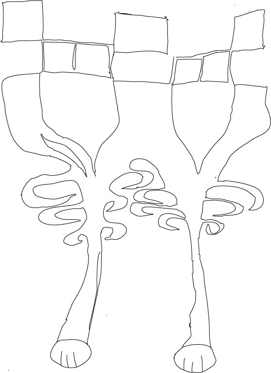
we were split up into groups and the aim was to select a section of a paper, each section had to represent a 'thing' which is supposed to have a head, torso and 'legs' our group came up with the following monstrosity;

The Original Image
   
Our task was to trace out the image to illustrator
i started by opening up the image on Photoshop, then I created work paths so that I could export it to illustrator, creating this final product:

Traced out image:

Task 2 - Name Logo

I started out by sketching some ideas for a name logo, the final idea war rather simple and minimalist

the first idea consisted of a symmetrical alignment with my name which included a hexagon for the background and for the letter 'O'
Then I came up with another logo which consisted of the following:

I started out on illustrator by typing out my name one on top of the other, then I tweaked the letter 'R' a bit so that it would show continuation with the other letters, finally I added the fleu-de-lys in the letter 'o' to show that scouting is my passion

Tuesday, 17 November 2015

Stress Flyer

I first coloured the background to represent a serene colour in this case light blue, then i added the text showing the location and the time of the seminar. I then added a picture of a hand holding a stress ball to show stress.

Tuesday, 3 November 2015

Task 2 Light and Dark Collage

A digital collage which is supposed to represent the differences between light and dark. For my piece I decided to create this image below.

This collage was created by:

  • creating a custom brush of the Mosta dome.
  • created a rotated image of the dome.
  • tilted the brush type to a diagonal
  • added a background behind the angle, then changed its mode to Luminosity to become more eerie
  • then I selected a crow, removed the crow itself and added it to a mask so that it would be transparent and take the background beneath it. I also set its mode to Exclusion
  • I added the bottom left angle statue and gave it a difference mode so that the colours of the brushes would be inverted and create an even creepier vibe to the collage itself. (giving it a darker contrast)
  • on the other hand,I gave the top right angle statue a linear light mode which makes it "brighter" compared to the other angle, thus creating a contrast between light and dark
  • I added a sword to the top right angel to show the battle between the two, the battle of light against darkness. I gave the sword a linear burn mode so that it would be more visible.
  • Then finally I added the text each of which individually: Light and darkness have the same effects which are a gradient overlay along with a drop shadow. Furthermore for "and" symbol i used  cyan gradient overlay with Bevel&Emboss along with a drop shadow, so that it would be more visible in the collage itself.
  • The font used is the Old English text Mt which I believed was the most suitable and ties the collage together.

Thursday, 22 October 2015

Saturation

Saturation can be defined as being the intensity and the chroma of a colour, which refers to the dominance of a hue in a colour where on the outer edge of the colour wheel the hue can be considered to be more pure. White, black and grey are used to reduce the colour's intensity and saturation. 

Light Scale

As one goes to the centre of the colour wheel the hue of the selected colour is less dominant meaning that the colours directly on the central axis are considered to be desaturated.
Desaturation: hue becomes less dominant, moves to circle's center

Now the image below shows the opposite of the image above, the fact that the outer colours of the colour wheel have more saturation.
"Pure" Hue With Complete Saturation: no other hues present

Colour Values and Hues

Hues are basically the different colours which have a different wavelengths. Few examples of hues can be Blue, orange, green and red.


The value of the colours indicates how bright a colour is. meaning that the higher the value the brighter the colour is or the more light it displays. For example if one were to take a bright yellow it would have a higher value, whereas the darker the colour the lower its colour value is.

Tints, Tones and Shades

Tints, tones and shades are basically different 'shades' of a pure colour. A tint is achieved by adding white to the selected pure colour, shade is when black is added to the colour and tone is when grey is added to the colour.

this meaning that a tint is lighter than the original colour, shade is darker than the original colour and a tone is softer than the original colour.


Print Vs Screen

When a user decides whether they are designing something which is going to remain on screen or is going to be printed, they have to take into consideration every possible factor which can range from the types of media, the audience targeted, the colours that are to be used, the layout desired and the technology that is going to be used.

There are various types of media:

  • magazines
  • product packaging
  • business cards
  • logos
  • HTML websites
  • animations\
The types of media that i mentioned above are all different media in which the designer can transmit his or her audience the desired message.
It is important that the designer keeps in mind the targeted audience that is going to see this design, if elderly people are targeted it would be a grave mistake not to create the design to be printed.

The content has to be interesting enough to entice the viewer to stay on the page or to look at the design.

In print everything has to be taken into consideration as the design can be used for various uses. Make sure that the design is not clustered and gets the desired space. Also, the designer must make sure to have bleed when creating the design to ensure a good outcome.

On the other hand for screen, the designer hast to make sure that the 'app' or advert would look good on various screen sizes, as now a days there are a lot of variations from one screen to another. 

The colour is also affected as print uses CMYK and screen uses RGB. Screen can also deceive the user on the desired outcome therefore it is always important to request a print preview so that the designer would know more or less how the outcome is going to be.

Obviously it always depends on what the company is trying to pursue for their product and for their adverts.

Wednesday, 21 October 2015

International Color Consortium better known as ICC Profiles

ICC profiles are used to describe colour whether if its light, dark, its range and even the distribution level of the colour itself. The International Color Consortium or better yet the ICC is used to analyse distinct colours in digital media. Basically the ICC creates the correct colours of inputted images either from cameras or scanners in order to present the image on a monitor or for print.

There are two fundamental types which are the input and the destination output, which originally consist of data which can be related to the devices co-ordinates that is the standardized colour space defined by the ICC.


Colour Depth

Colour depth refers to the number of bits per pixels a computer monitor can display to represent a specific colour. The more bits per pixel, the more colours can be displayed by the monitor, thus meaning that the higher the bit per pixel the better quality the monitor has.

The first graphic cards only supported 1-bit colour which means that the colour was monochrome. But now a days due to our technological advancements computers can store at least 32-bits of colour which displays about 16 million colours


Down below I am going to show the difference between;  24 bpp, 16 bpp, 12 bpp, 10bpp, and 8 bpp.
(bpp- Bits per pixel)

24 Bits Per Pixel - it is the most clear out of all


16 Bits per Pixel - as one can see there is a  minimal change from the 24 Bpp

12 Bits per Pixel - the change is now more visible from the 16bpp


10 Bits Per Pixel - The change is now becoming more visible, the lower the bits per pixel is.


8 Bits Per Pixel - now the change is clearly evident from the other BPP's as there are now less colours which are being used when 8 bpp are being used.

Printing types

There are various printing types, and each print is used for a specific purpose. If one were to use any type of printing on a product, they would most probably be disappointed in the final result as what one sees on screen it is not always what one gets.

The main reason why we don't always get the desired result when we print is because the human eye is capable to detect millions of colours, but the computer monitor is only able to display selected colours.

The CMYK colour model is used in offset printing, which uses individual plates for each colour; cyan, magenta, yellow and black. The four plates are aligned with great precision to create the final product.

The pantone colour model can also be used, so that the product would be the same colour universally. For example the HSBC logo has the same red world wide, these generally follow the brand guidelines in order to be the same.


Offset Printing

Offset printing is one of the mist common type of printing, it can either be sheet-fed or be web offsets.The difference between the two is that sheet-fed is fed individual paper, whereas web offsets have a continuous roll of paper, which is fed through the printing press.

In offset printing the design is transferred from  a printing plate to a rubber blanket. The image is crated with use of water and oil, where there is the oil the image is supposed to be there,

Sheet-fed offset printing is generally used for small, medium or high works.


Gravure Printing Method

In this type of printing cylinders are used to produce the print, In order for the print to be made, one need a cylinder for every colour; cyan, magenta, yellow and black. Each cylinder is etched so that it can collect ink to be transferred on to paper. The gravure printing method has one of the highest quality of printing.


Flexo Printing Method

Flexography is generally used for the printing of packaging materials, it is used for corrugated containers, folding cartons, multi-wall sacks, plastic bags, milk and beverage cartons etc...

A typical flexo printing machine  is similar to a Gravure printing machine as it uses cylinders for each colour.


Monday, 19 October 2015

Vector vs Raster

The main difference between raster and vector is that a raster image is made up of pixels, whereas vectors are made up of mathematical calculations, meaning that it creates geometric shapes. Thus meaning that when a raster image is zoomed in, one is able to see each individual pixel of the image. On the other hand if one where to zoom in on a vector image it would still be visible and consist of smooth lines.


The pros and cons of a vector images:

Pros
  • The images can be scaled indefinitely, as the image is never going to lose its quality.
  • The file size is going to be smaller as a vector files only needs 4 points to create a square.
Cons

  • Detail is limited, as it is not efficient enough for complex images that need exact colours. Basic gradients are possible, but its very difficult to include the detail a raster image would have.
  • Effects are limited, as vectors are created from simple points and lines.
Moreover the pros and cons of a raster image are the following:
 
Pros
  • Detail is unlimited, as a raster image is able to comprehend various effects, such as blurring and drop shadows.
  • Detail is also unlimited as each pixel is able to have its own gradient, meaning that it can leave open endless gradients and hues.
Cons
  • once an image is zoomed in it loses all of its sharpness, as a  raster image would try to guess the missing pixels.
  • it takes a lot more data, as each pixel has an individual colour. Eg. if someone where to create a square, it would need 300 individual pixels of colour